
Que 1: State True or False:
(i) Graphs let the audience visualize trends quickly.
Ans: True
(ii) Graphs are a compact way to show information.
Ans: True
(iii) Graphs make it hard to find the main point of some data.
Ans: False
(iv) Graphs add a visual model to a presentation.
Ans: True
(v) Graphs are not good at showing changes and relationships.
Ans: False
(vi) Line graphs are good at showing changes over time.
Ans: True
(vii) Line Graphs are also called histogram.
Ans: False
(viii) Pie Charts show how parts are related to the whole.
Ans: True
(ix) Pie Charts can make multiple comparisons.
Ans: False
(x) Bar Graphs and Line Graphs show trends.
Ans: False
2. What does this button mean ![]()
Ans: (c) Group together the selected cells and center the content. (Merge and Center)
3. What type of chart is this?
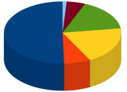
Ans: Pie Chart
4. We need to bold the contents of Columns A and C, Row 14 and Cells D8 and E7. Is it possible to do all the formatting in one action?
Ans: Yes
5. I have created a bar chart which represents sales for September, October and Novemer. I add December figures to the end of the range that the chart was created from. Will the chart automatically update to include these figures?
Ans: No
6. I want to print the gridlines on my Calc worksheet so that my data is easy to read. The first time I print my worksheet I choose File Print OK from the menu. Will the gridlines be printed?
Ans: No
7. When you insert a column into a worksheet, it will always be inserted to the left of the column that contains the active cell.
Ans: Yes
8. What is formatting? Why/How is it useful?
Ans: The general arrangement of data is known as formatting.
It is useful
- Formatting makes the worksheet presentable.
- Formatting provides worksheets with a neater and more legible outlook.
- Formatting helps in changing the background color, border, border color, etc.
- Formatting change the appearance of data i.e. numberse, text, date, etc.
9. What are the different components of chart? Explain.
Ans: There are various components of a chart. These are
- X-axis (Category Axis): This is the horizontal axis known as the category axis.
- Y-axis (Value axis): This is the vertical axis known as value axis.
- Data Seris: This is the set of values you want to plant in the chart.
- Chart area: This is the total region surrounding the chart.
- Plot area: This is the area of the chart in which your data is plotted.
- Chart Title: This is the descriptive text aimed at helping the user identify the chart.
- Axes titles: Titles given to the different axis called Axes titles. i.e. X, Y and Z axes.
- Legend: The legend helps in identifying the various plotted data series.
- Gridlines: These are the horizontal and vertical lines in the plot area.
- Data label: It provides additional information about a data marker.
10. Define the following terms: (i) Embedded chart (ii) Chart Sheet
Ans: (i) Embedded Chart: An embedded chart is a chart object placed inside a worksheet along with other data.
(ii) Chart sheet: A chart sheet is a sheet having only a chart and no other data.
