
Type B: Application-Based Questions
11. What is a histogram? How do you create histograms in Python?
Ans: Histogram is a type of bar chart that is used to represent statistical information by way of bars to display the frequency distribution of continuous data. It indicates the number of observations that lie in-between the range of values, which is known as class or bin.
A histogram chart helps you to display the distribution of numerical data by rendering vertical bars. You can compare non-discrete values with the help of a histogram chart.
hist( ) function of the PyPlot interface is used to create histograms in Python.
For Example:
import matplotlib.pyplot as plt
import numpy as np
score = np.random.randint(15, 30, 40)
plt.hist(score, bins = 10)
plt.title(“Score Analysis”)
plt.show( )
12. What are various types of histograms that can be created through the hist() function?
Ans: In Matplotlib PyPlot, we can make four types of histograms like –
• bar:- is a traditional bar-type histogram. If multiple data are given the bars are arranged side by side.
• barstacked :- is a bar-type histogram where multiple data are stacked on top of each other.
• step :- generates a lineplot that is by default unfilled.
• stepfilled :- generates a lineplot that is by default filled.
13. When should you create histograms and when should you create bar charts to present data visually?
Ans: Histograms are used to show distributions of variables while bar charts are used to compare variables. Histograms plot quantitative data with ranges of the data grouped into bins or intervals while bar charts plot categorical data.
14. What is a cumulative histogram? How do you create it using PyPlot?
Ans: The cumulative histogram is a histogram in which the vertical axis gives not just the counts for a single bin, but rather gives the counts for that bin plus all bins for smaller values of the response variable. The last bin gives the total number of data points.
hist( ) function of PyPlot interface is used to plot a cumulative histogram with the cumulative argument is True. By default cumulative argument is False.
For Example:
import matplotlib.pyplot as plt
import numpy as np
score = np.random.randint(15, 30, 40)
plt.hist(score, bins = 10, cumulative = True)
plt.title(“Score Analysis”)
plt.show( )
15. What is frequency polygon? How do you create it?
Ans: A frequency polygon is a type of frequency distribution graph. In a frequency polygon, the number of observations is marked with a single point at the midpoint of an interval. A straight line then connects each set of points.
Frequency polygon makes it easy to compare two or more distributions on the same set of axes.
Python PyPlot module of matplotlib does not have any method to plot frequency polygon. You can create a frequency polygon by following steps:-
- Plot a histogram from the data
- Mark a single point at the midpoint of an interval or bin
- Draw straight lines to connect the adjacent points.
- Connect first data point to the midpoint of the previous interval on x-axis.
- Connect last data point to the midpoint of the following interval on x-aixs.
16. What is the 5-point summary?
Ans: 5-point summary consists of: –
- a) The minimum range value
- b) The maximum range value
- c) The upper quartile
- d) The lower quartile, and
- e) The median
This collection of values is a quick way to summarize the distribution of a dataset.
17. What is Boxplot? How do you create it in Pyplot?
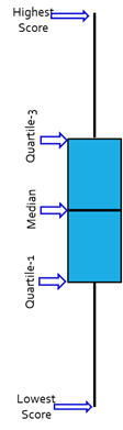
Ans: A Box plot is a five-point summary chart, which is used to show the range and middle half of ranked data. Ranked data is numerical data such as numbers.
The middle half of the data is represented by the box.
The highest and lowest scores are joined to the box by straight lines.
The regions above the upper quartile and below the lower quartile each contain 25% of the data.